
Faz tempo que não escrevo sobre a situação do coronavírus em Orlando. Basicamente porque estava ficando repetitivo, as coisas não estavam mudando muito – na verdade pioraram durante o verão aqui, e agora está melhorando. Mas ainda estamos com mais novos casos de coronavírus por dia do que estávamos em março e abril, o que […]
Main Content
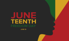
Juneteenth, conheça a história desse dia
Hoje é comemorado nos EUA o Junteenth, o dia em que mais de 250 mil escravos negros no Texas foram informados de sua libertação. O Presidente Abraham Lincoln tinha declarado os escravos livres mais de dois anos antes, em 1 de janeiro de 1863. Os estados do sul não aceitavam a abolição e só com […]

Coronavírus em Orlando – 25 de maio
Comecei e parei esse post várias vezes no último mês. Estamos há 2 meses em casa, já passamos das 10 semanas de quarentena. Só saímos pra ir a farmácia buscar remédios 3 vezes até agora, o resto estamos resolvendo tudo online. No mundo são 5.467.945 casos confirmados de Covid-19 e 344.731 mortos; sendo 1.657.441 casos […]

Coronavírus em Orlando – 29 de abril
Estamos há quase 7 semanas em casa. Hoje eu deveria estar embarcando em um cruzeiro rumo ao Hawaii, mas é claro que foi cancelado. Estou triste mas sei que somos privilegiados, estamos em casa, com saúde, enquanto o Covid-19 já matou mais de 60 mil pessoas nos EUA até o momento – não tenho do […]

Coronavírus em Orlando – 17 de abril
Estamos há 5 semanas em casa, os dias vão passando lentamente com a rotina de escola, casa e remarcando viagens dos meus clientes da Colagem Travel. Tenho lido bastante, livros leves, não tenho tido cabeça pra muita coisa. Os números de infectados com o coronavírus continuam subindo e tento não acompanhar todos os dias pra […]

Coronavírus em Orlando – 11 de abril
Estamos há 4 semanas em casa, os dias se repetem sem grandes mudanças por aqui. Continuamos na nossa bolha familiar esperando essa pandemia de coronavírus passar. Sabemos que temos sorte, a situação não é nada boa. No mundo hoje são 1.754.457 pessoas com Covid-19, sendo que 107.520 morreram por causa da doença. Aqui nos EUA […]

Coronavírus em Orlando – 6 de abril
Hoje dia 6 de abril de 2020 contamos 24 dias em casa (desde o dia 13 de março). Não fomos nem ao mercado (estou fazendo compras via delivery) e as crianças estão na segunda semana de escola online. Estamos na nossa pequena bolha familiar acompanhando os horrores do coronavírus pela internet. Ao invés de começar […]

Coronavírus em Orlando – 1 de abril (sem brincadeiras)
Hoje é 1 de abril mas nem estão rolando muitas brincadeiras, todos preocupados com a pandemia. Neste momento já são 932.605 casos de Covid-19 no mundo com 46.809 mortes, sendo 213.372 casos nos Estados Unidos com 4.757 mortes. Na Flórida são 7.773 casos confirmados e 101 mortes. A situação é grave e o Presidente Trump […]

Coronavírus em Orlando – 29 de março
Estamos há 16 dias em casa e a situação do coronavírus aqui nos Estados Unidos é bem grave. Neste momento são 135.499 casos confirmados de Covid-19 no país com 2.381 mortes. No mundo são 710.918 casos confirmados com 33.551 mortes. A Itália continua sendo o país com mais mortes, com 10.779, mas a Espanha está […]